Dynamic Feedback in UX: Designing Clear Responses for Better UI
Discover how dynamic feedback animations reduce user anxiety and improve conversion. Learn best practices for success, error, and loading states in UX design.
Dynamic Feedback in UX: How to Give Clear and Immediate Responses to User Actions
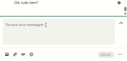
Have you ever clicked a "Submit" button on a website and sat there wondering if it actually worked? You wait three seconds, then five, and finally, you click it again—only to find out later that you’ve accidentally placed the same order twice. This "void" of information is one of the most common causes of user frustration and high bounce rates.
In the world of User Experience (UX), we bridge this gap through UX dynamic feedback. These are the visual responses, often powered by subtle animations, that inform a user that their action has been received and processed. Whether it’s a button that changes color, a spinner that indicates progress, or a "success" checkmark, dynamic feedback is the conversation the interface has with the user.
In this guide, we will explore why feedback is essential for a reliable user experience and how you can implement it to eliminate uncertainty and reduce cognitive effort.
What Is Dynamic Feedback?
Dynamic feedback refers to any visual, auditory, or haptic response that occurs immediately after a user interacts with a digital interface. In UI design, it primarily manifests as visual feedback animations that show the result of an action.
Think of it as the digital equivalent of a physical light switch. When you flip a switch, the tactile "click" and the immediate illumination of the room provide instant feedback. Without that response, you’d be left wondering if the bulb is burnt out or if the power is down.
"Design is the interaction the user doesn’t notice, because it works." — Alan Cooper
The goal of dynamic feedback is to make the interface feel responsive and "alive." When users receive immediate cues, they feel in control. This reduces the cognitive load required to navigate an app because the user doesn't have to guess what is happening behind the scenes.
Why Dynamic Feedback Matters for Your Business
Beyond just looking "cool," dynamic feedback has a direct impact on your bottom line and user satisfaction metrics.
1. It Reduces User Anxiety
Uncertainty leads to stress. When a user clicks a button to transfer money or save a document, they need to know it happened. Immediate feedback stops the "Did I click it?" mental loop, creating a sense of security and trust in your platform.
2. It Prevents Error and Duplicate Actions
As mentioned in our intro, lack of feedback often leads to users double-clicking or refreshing the page. This can cause duplicate database entries, broken API calls, and a messy backend. Clear "Loading" and "Success" states prevent these redundant actions.
3. it Increases Perceived Performance
Interestingly, well-designed feedback animations can make a slow process feel faster. A custom, engaging loading animation (skeleton screens or spinners) keeps the user's eye occupied, making a 3-second wait feel significantly shorter than a blank white screen would.
4. It Improves Accessibility
For many users, especially those with cognitive disabilities, clear visual cues are essential for understanding how to interact with a system. By using multiple channels—like color changes plus an icon animation—you ensure your UI is understandable for everyone.
Is your interface feedback working?
Get an instant analysis of your interface against 80+ UX principles.
Scan Your Site FreeHow to Implement Dynamic Feedback Effectively
Implementing feedback isn't just about adding "bounce" effects to every button. It requires a strategic approach to ensure the animations help rather than hinder.
1. Identify the Main Actions
Start by auditing your interface to find high-stakes or high-frequency actions. These include:
-
Submitting forms
-
Adding items to a cart
-
Deleting data
-
Toggling settings
-
✅ Do this: Prioritize feedback for actions that take more than 100ms to process.
-
❌ Avoid this: Adding heavy animations to every single hover state, which can clutter the UI and distract the user.
2. Define the Type of Animation
Different actions require different types of feedback.
A. Success and Error States
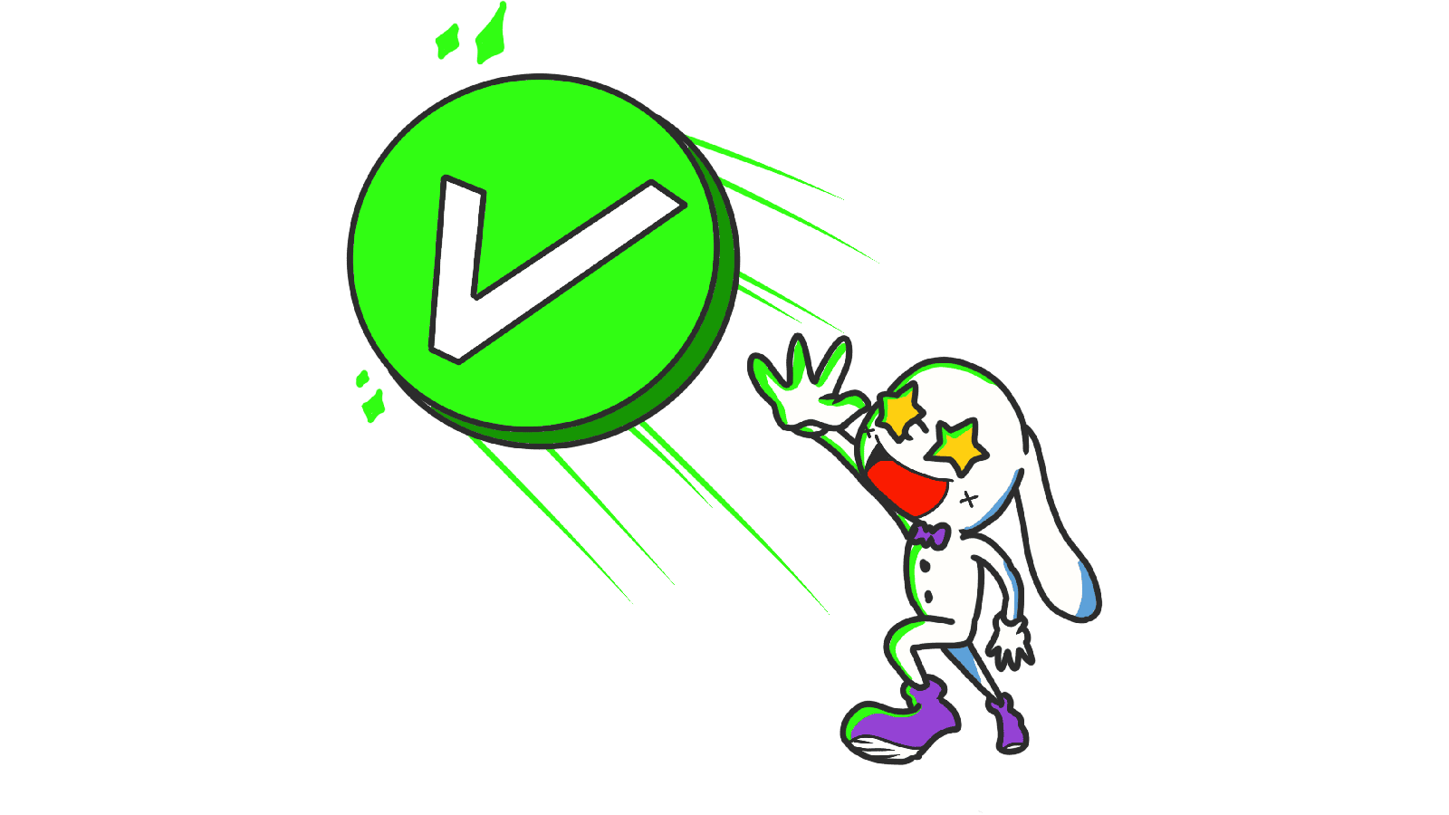
When a user completes a task, celebrate it with a success animation, such as a green checkmark that draws itself or a gentle fade-in of a "Saved" badge. Conversely, if something goes wrong, use a "discreet shake" or a red icon. A shake animation mimics a human shaking their head "no," which is an intuitive cue that the action was rejected.

B. Loading Indicators
If a process takes more than a second, you must show a loading state. A looping indicator, like a spinner or a progress bar, tells the user the system is working. This is crucial for maintaining the "Visibility of System Status."

3. Optimize Duration and Easing
Feedback must be fast. If an animation takes too long, it feels sluggish and can actually frustrate the user. Aim for a duration between 200ms and 500ms. For more on the timing of UI movements, check out our guide on Animations That Bring Life: General Animation Principles.
4. Test and Refine Across Devices
An animation that looks great on a high-end desktop might stutter on an older mobile device. Ensure your feedback is "performant." Use CSS transforms rather than changing height/width properties to keep the frame rate high and the experience smooth for all users.
Common Dynamic Feedback Mistakes to Avoid
1. The "Invisible" Feedback
- The problem: Changing only a tiny pixel of color that the user's eye isn't focused on.
- The fix: Ensure the feedback happens near the point of interaction (e.g., inside the button the user just clicked).
2. Over-Animating
- The problem: Using excessive "bouncing" or "spinning" for minor actions.
- The fix: Use the "subtlety rule." If a user notices the animation more than the result of the action, it's too much.
3. Delayed Feedback
- The problem: The animation starts 500ms after the click.
- The fix: Trigger the visual change immediately (under 100ms) to maintain the "cause and effect" link in the user's mind.
Dynamic Feedback in Action: Real Examples
Looking at how industry leaders handle feedback can provide great inspiration for your own projects.
When sending messages, LinkedIn understands that the "delivery" is the most important part of the experience. They use a small animated spinner immediately after you hit send, which then transitions into a subtle fade or timestamp. This tells the user that the message hasn't just disappeared into the ether—it’s actively being processed by the server.
Duolingo

Duolingo is a master of gamified feedback. When you answer a question correctly, the "Check" button doesn't just change color; it triggers a celebratory animation and a satisfying sound. If you get it wrong, the button performs a subtle "shake" and the color shifts to red. This immediate, high-contrast feedback is a core part of why the app is so addictive and easy to use.
See how your site compares
Our AI analyzes your interface against the same principles used by LinkedIn and Duolingo.
Get Your Free UX ScoreRelated UX Principles
Understanding dynamic feedback is just one piece of the animation puzzle. To create a truly cohesive interface, consider these related concepts:
Resources & Further Reading
For those who want to dive deeper into the technical and psychological aspects of interaction design, we recommend these resources:
Material Design Interactions
See Google's guidelines on selection and interaction feedback.
UX Motion: Feedback Principles
An in-depth article about the role of feedback animations in modern design.
Frequently Asked Questions
Don't Guess Your UX. Scan It.
Upload your screens or paste your URL to get expert-level UX analysis in under 3 minutes.
Start Free ScanRelated Articles
Buttons That Work: A Comprehensive Guide to UI Button Design
Master the art of button design UX. Learn best practices for CTA buttons, accessibility standards, and how to drive higher conversions through better UI.
Jakob's Law: Why Familiarity is the Ultimate UX Design Principle
Learn how Jakob's Law impacts user experience. Discover why users prefer familiar interfaces and how to leverage mental models to increase conversions.
Miller's Law in UX: How to Optimize Cognitive Load for Better Design
Master Miller's Law to reduce cognitive load. Learn how chunking and the 7±2 rule improve UX, increase retention, and boost your site's usability.